Design notes for the new layout of USS Clueless
Stardate 20020630
There seems to be some confusion about just what I've done with the new design I deployed yesterday, and I wanted to clear some of it up. I've moved this to a separate page because it's going to be graphic-intensive.
For instance, one reader writes: "Arial fonts are much easier to read."
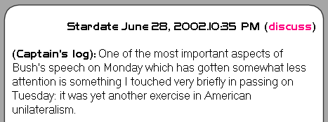
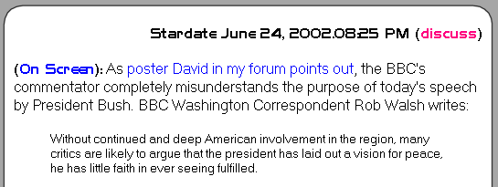
I, personally, despise Arial. But what I hate even more is web sites which decide for me what font I'm going to see (and what size, and what page width and what colors and essentially everything else). The new main page format for USS Clueless doesn't actually specify a font for the primary text; it's using your browser default. In my case that's Microsoft Sans, but if your browser default is "Times New Roman" then that is what you'll see. So if you like Arial, then set your browser default to Arial. Here's some examples:

My default "Microsoft Sans"

"Arial"

"Times New Roman"
These are all screen captures done with IE 5.5 on Win2K. I'm just going into my browser and making modifications to the settings and then capturing how the page changes and putting them up here as graphic images.
The only text which doesn't change is the Stardate and the initial banner, which use a font called "Handel Gothic" if it's installed on your computer, and uses your browser default if not. By the way, Handel Gothic is also what I used for the "USS Clueless" logo in the viewport graphic, only in that case it's actually a picture so it doesn't depend on the font being installed on your computer. I don't overdo the use of Handel Gothic, but I think it adds a nice flavor to the page, and I recommend people download it and install it (Windows version, Mac version). But if you don't, the page will still look fine. (Just not as cool.)
Font size is another example: I force 10 point in the sidebars, but the main section uses your browser default:

Text size "Larger"

Text size "Smaller"
The only color I'm forcing is the background, to white for the main section and a very light gray for the sidebars. But I'm not forcing the font color itself, so if you want green you can have it. Just adjust the old browser:

Text Color "Green"
Ben writes: "The new lay-out's nice, and looks "cleaner" than the old one. My only caveat would be that the text area's now slightly too wide for comfortable reading. My monitor's set on 1024 x 768, and it's about twice novel text width."
I'm not forcing that anymore either. I used to with the old design, which forced the entire page into 750 pixels (so that it was readable on an 800 pixel display, which still represents half of users overall). The new design adapts to your browser width and uses it all, but never more, so you can control the width but you never have to scroll horizontally. If you don't like it wide, make it narrower:

Wider browser window

Narrower browser window
You are in control; you can choose what you want and it adjusts. There is an exception to this: if I put a picture or a table in the text, then that forces a minimum width on the page. But I will try not to make those huge, and it shouldn't be a problem most of the time. But for the most part, you have the ability to customize the page presentation pretty much to your heart's content.

Arial, narrow window, "smaller" text, Blue font color

Times New Roman, wider window, "Larger" text, Black font color
Whatever you want, you got. I think that's how the web should be. Too many web designers are on a power trip, and try to control page presentation down to the pixel level. They are thinking in terms of the web as "magazine without paper", rather than accepting the web for what it is. (It also betrays that they think the formatting is much of what they are presenting. If the content is king, the formatting doesn't matter. But a lot of the people who do this for their sites end up with gorgeous presentations of truly banal material.)
Part of why I can do this is that even when I want to change sizes, such as for indented quotes, I still don't specify font sizes. What I do is use the <small> tag, which changes the font size relatively instead of absolutely.

Text size "Medium"

Text size "Larger"
As a general rule, I'm trying to control as little as I possibly can, and leave as much under control of your browser defaults as possible. (Usually I end up having to go into the HTML and strip out things that my WYSIWYG tools have helpfully added for me that I didn't want, which would have overridden browser defaults.)
Some of that is selfish on my part, because I look at my own page with my desktop (1920*1440 on a 21" display) and also on my notebook computer (which is much smaller), and I have different browser settings there (in particular, I use a narrower window and a smaller text size; also, it's the difference between a CRT and an LCD). But partly this is because I know how much I hate it when other people force really awful settings on me. For instance, there are a lot of people out there using small displays (800*600, which I'm trying to make sure to support with this design) and they don't realize the sins they're committing. They design their pages to look good for them but they're unreadable for people with larger displays. This is a synthetic example of some of the kinds of things I've seen:
